Design systems
DesignOps
Accessibility (WCAG)
Leadership
Enterprise
B2B
RISE — Worten Design System
The system Worten didn’t know they needed.
Company
Role
Lead Designer & Product Owner
Period
Apr 2023 - Present
Team
7 designers, 5 developers
95%
Component adoption
across 31 teams
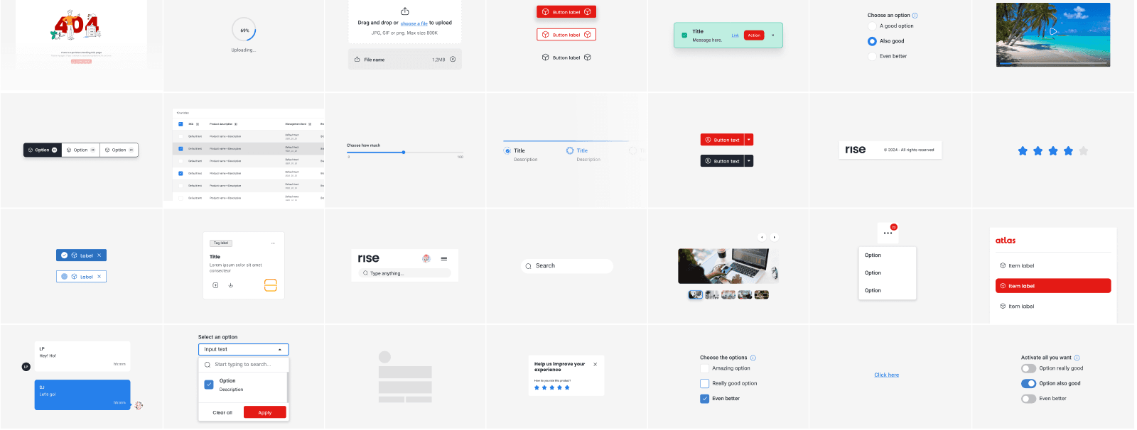
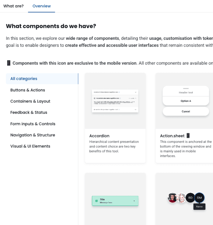
60+
Components built from foundations
to complex patterns
Of the designers report saving
significant time vs. before
Context
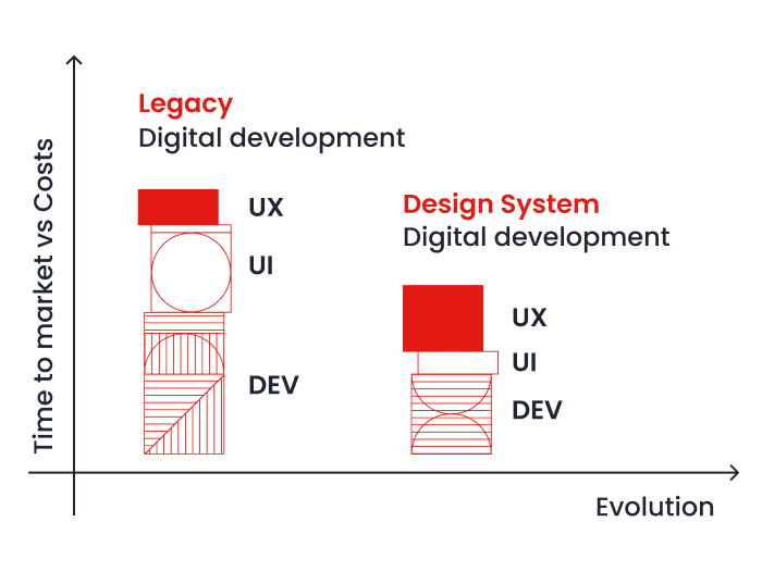
Worten's digital ecosystem had grown organically over years, resulting in 20+ B2B products built in silos — 7 of which were audited in depth. Each team created their own components, maintained separate design files, and spent 40% of design time recreating existing solutions.
The impact
The real cost wasn't just duplicated work — it was inconsistent user experiences across products, slower time-to-market, and a growing gap between design and engineering velocity.


Built RISE — a scalable design system that unified 20+ products under one visual language.
I functioned as both Product Designer and Product Owner, managing the full lifecycle from strategy to adoption.

1
Aligning 20+ product teams under one visual language
Decision: Negotiated a dedicated investment window by showing leadership that doing nothing was the most expensive option.
✓ Full stakeholder buy-in
✓ Zero roadmap conflicts
2
Balancing consistency with product team autonomy
Decision: Built a governance model where product designers own the system in their teams — keeping quality without slowing teams down.
✓ 95% adoption across teams
3
Making accessibility non-negotiable from day one
Decision: Every component was built with WCAG AA compliance from day one — with no exceptions.
✓ Accessibility standards


Some people are still not fully converted. That's honest. But the system is alive, adopted, and growing— and that only happens when people choose to use it.

Inspired by Brad Frost's Atomic Design principles — adapted to fit Worten's product ecosystem and team structure.
Figma
Supernova
Confluence
HTML & CSS
Outsystems
Other technologies


Roadmap Focus
✓ Multi-brand theming capabilities
✓ Real-time collaboration features
Note: Results based on internal survey (Q4 2025) and project metrics. Full ROI analysis scheduled for Q2 2026. Limited sample size — values reflect user perception, not objective ROI.
Principles
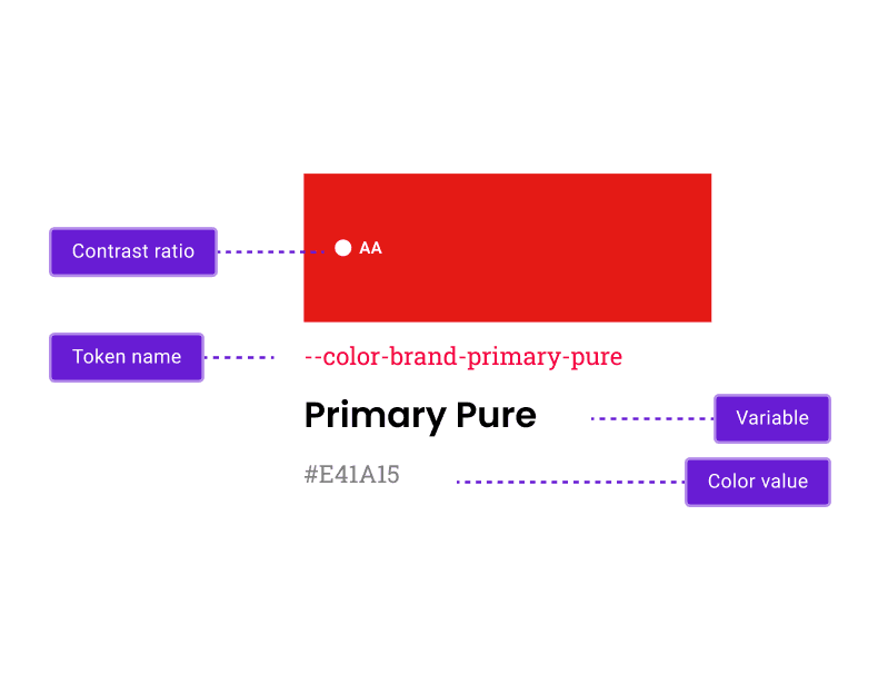
RISE is publicly documented — components, tokens, accessibility guidelines, and more.
One place for designers and developers. No outdated PDFs. No tribal knowledge. Just a living system that speaks for itself.


This wouldn't have been possible without the designers and developers who were part of the team at different stages of the journey. They know who they are.
I helped consolidate over 25 legacy tools into a single digital workplace — without losing anyone along the way.
Atlas — Where the system proved itself
Atlas is Worten’s operational backbone — running everything from site configuration to financial reporting. Upgrading it to RISE wasn’t just a visual refresh. It was proof that what we built could hold up under real complexity.